Support Design
Ornament Design Best Practices
We’ve compiled a few do’s and don’ts to help you optimize your ornament designs for printing.

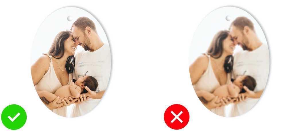
Do: Use images of sufficient quality and resolution. We suggest no smaller than 300 dpi for ornaments. For example, oval ornaments should be 835x1110 pixels @ 300 dpi.
Don't: Use low resolution images. Try to always use original source art when you can. If you need to resize your art, be careful that you are not losing critical image quality.
*Pro tip - If you are resizing images in Photoshop. Convert your layer to smart object, this will retain image quality when you resize your image.

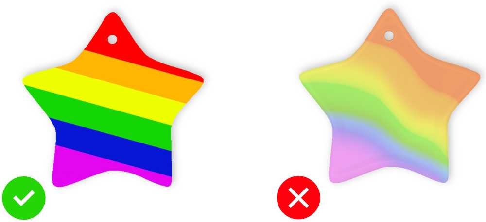
Do: Use flat color whenever possible.
Don't: Use gradients and drastic shifts in color opacity.

Do: Use simplified designs that are high contrast. Always maximize size of text, making it easier to read.
Don't: Use low contrast images, making it difficult to see fine detail like shadows and text.

Do: Maximize size of photos and text. We suggest utilizing approximately half of the ornament print area for portraits.
Don't: Use small thumbnail portraits and/or small text combined with busy photographic or painterly backgrounds.

Do: Keep important design elements inside of the safe area.
Don't: Extend important design elements over the safe area that you intend to keep 100% visible.